Back to projects

How an emergency online store
turned a fatal season into the best one ever

March 2020, first COVID lockdown. My brother’s plant nursery was about to lose the six weeks that make its entire year. In ten days I built an online store and a pickup system around it: no delivery, no online payment, every order collected at the greenhouse on an individual time slot agreed by phone.

+170% April revenue vs the best April ever
10 days From decision to live store
14 Orders on day one
0 Payments taken online, by design

This is the only project where I deliberately sacrificed aesthetics entirely. The screens below are the real ones, from 2020, exactly as they shipped.

Every decision went through one filter: is this the best possible option for THIS clientele? Not the best looking store. Not the most complete one. The one an anxious seventy year old could use, alone, on the first try.
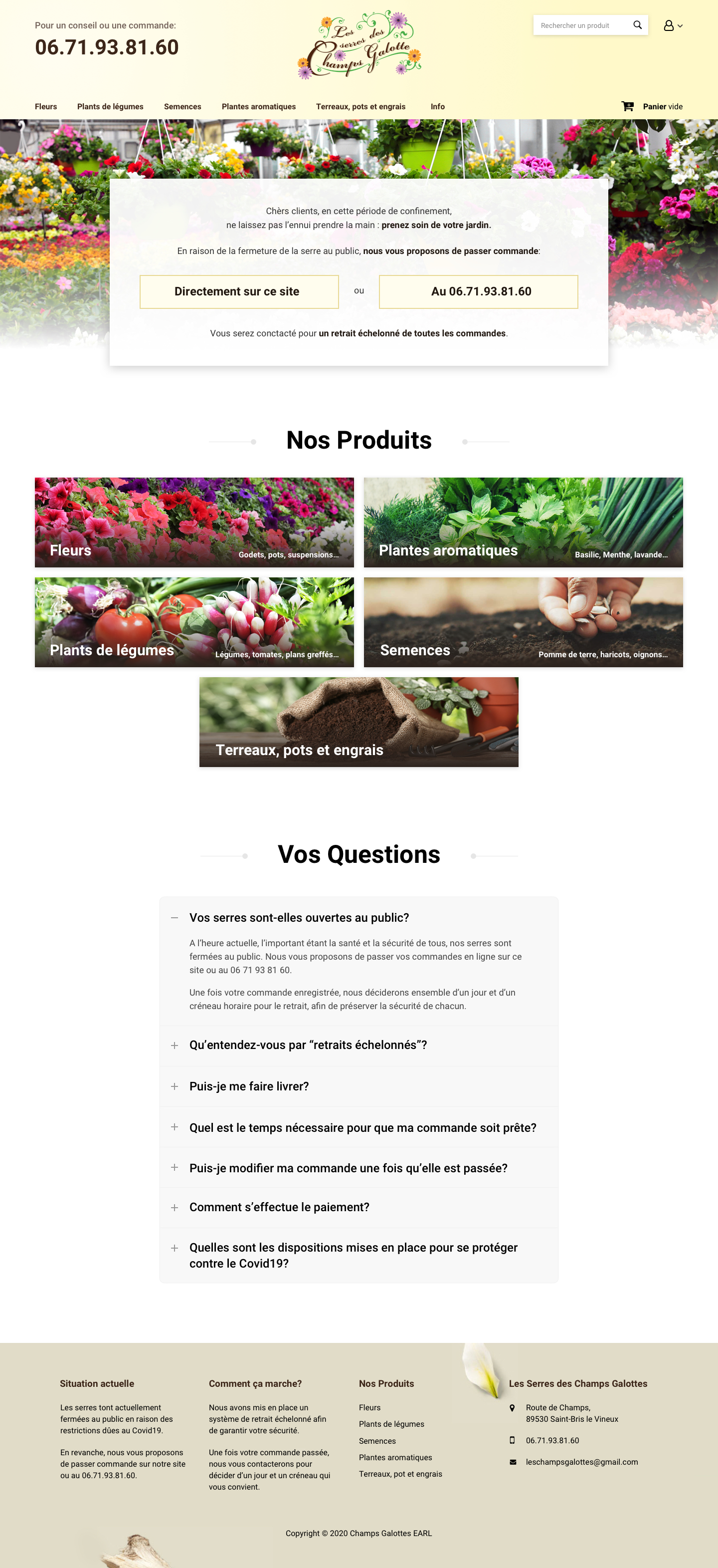
The full Champs Galottes home page in 2020
Home. The lockdown notice and the two ways to order, then the product families.
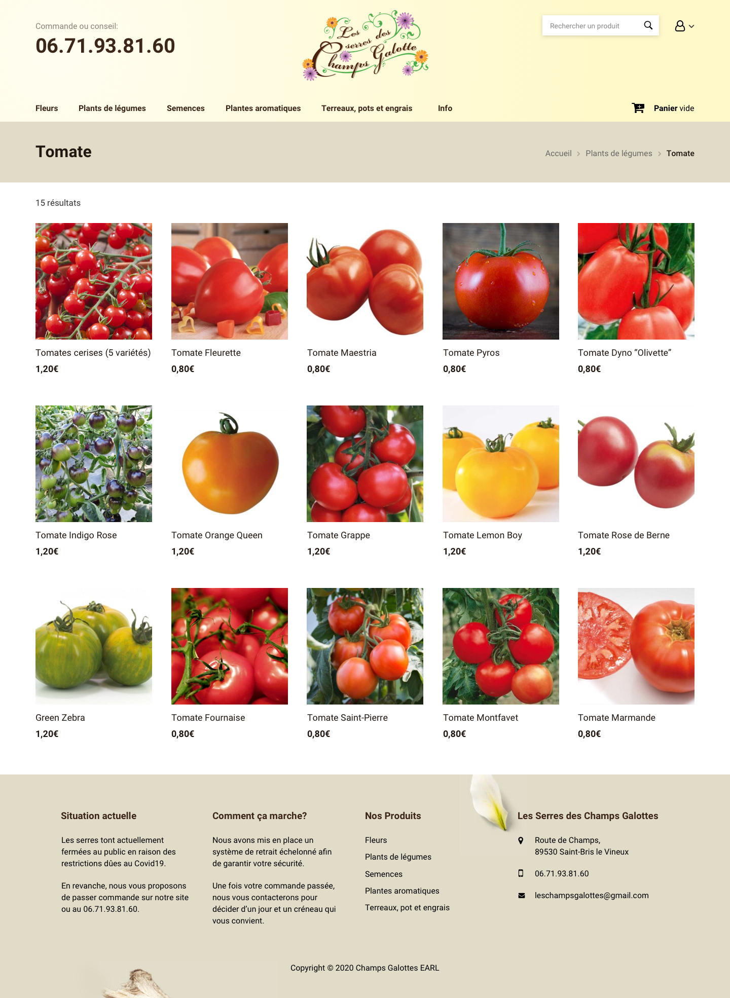
The tomato category page, a plain grid of products with prices
Category. A plain grid, a price, nothing else. No filters, no sorting, no SKU.
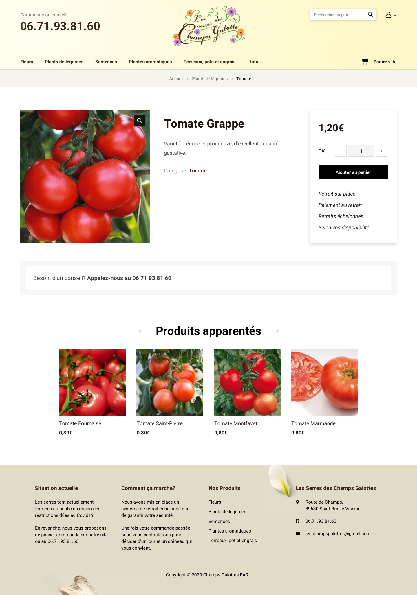
A Champs Galottes product page for a tomato plant
Product. One photo, one price, one button, and the pickup rules underneath.

Six weeks that make the whole year

My brother Johann owns Les Serres des Champs Galottes, in the Yonne. He is a small local grower: he produces his own flowers and vegetable plants and sells them straight to the public.

Horticulture has one particular trait. The large majority of the year’s revenue happens over one short, intense spring season, from early April to mid May, then more calmly until mid June.

The lockdown announced in March landed at the worst possible moment for growers. The production costs, seeds and compost, were already spent. The greenhouses were closed by law. The season was about to start.

For most growers, losing a spring season can kill the business. We needed an emergency solution.

The solution: an online store, and a pickup system built around it

I had the e-commerce experience to put a shop online quickly and cheaply. So that was the plan: an emergency online store for a nursery that had never sold anything online, and a drive-through pickup built around it.

The store was the easy half. Every real constraint sat outside it.

The constraintThe decision
Legal. Greenhouses closed until further notice, and total uncertainty about what would be allowed next. Keep the greenhouses closed to the public and sell without anyone entering them.
Delivery. Logistically and financially out of reach. No delivery at all. Orders are collected on the greenhouse car park, and nowhere else.
Safety. How do you protect customers, most of them elderly and worried about their health? Staggered pickup. We call every customer once the order is ready and agree an individual time slot. Masks, gel, distance.
The clientele. Amateur gardeners, high average age, wary of ordering online. No online payment, you pay at pickup. A phone number reachable all day, so anyone who refuses the web can still order. And an interface stripped to the bone.
Visibility. How do you tell customers about a shop that does not exist yet, when almost no cars pass the greenhouse anymore? Facebook and word of mouth, nothing else. See section 03.
Operations. The whole organisation had to be rethought, and picking orders is a large extra workload. Family. Once the store was live I joined my brother and his employee to keep the greenhouse running and pick orders. My nephew and a friend joined later. My mother took the orders and the pickup calls.
Time. Everything had to be ready for yesterday. Ten days, catalogue included.

No online payment was the decision that carried the most. One choice, three problems solved. Elderly customers could order without ever typing a card number. The price stayed adjustable at pickup, for an addition or a missing plant. And it took days off the build.

One detail says a lot about the period. When we made these choices, this was not yet legal for growers, while supermarkets were allowed to sell the same plants in looser conditions. We went ahead anyway and waited for authorisation. It came quickly, and the government guidance that followed matched what we had already built.

The unknown: would anyone find out the shop existed?

This was the one question I could not design my way out of. There was no customer database, so there was no way to contact a single existing customer individually. And I knew a brand new site had no chance of ranking on Google in time. Word of mouth was the entire marketing plan.

What we had on our side:

  • Ten years of local reputation
  • Customers calling every day
  • 600+ followers on Facebook
  • No need to reach anyone new
  • Gardening is daily conversation
  • Lockdown is good for gardens
  • A sunny April forecast

That fourth one mattered more than it looks. Unlike almost every e-commerce project, this store was not trying to reach a younger audience or a wider area. It only had to let the existing local customers stock their gardens. That narrowed every design decision, and it is why the store could be this plain.

Reassure and explain, on every page

The first job of the site was not to sell. It was to inform and reassure customers who were often old, often in fragile health, and rarely comfortable with the internet. Three words drove it: simple, clear, reassuring.

A large phone number is the first thing visible, top left, on every page of the site. On mobile every phone number on the site is a button: touch it and the call starts.

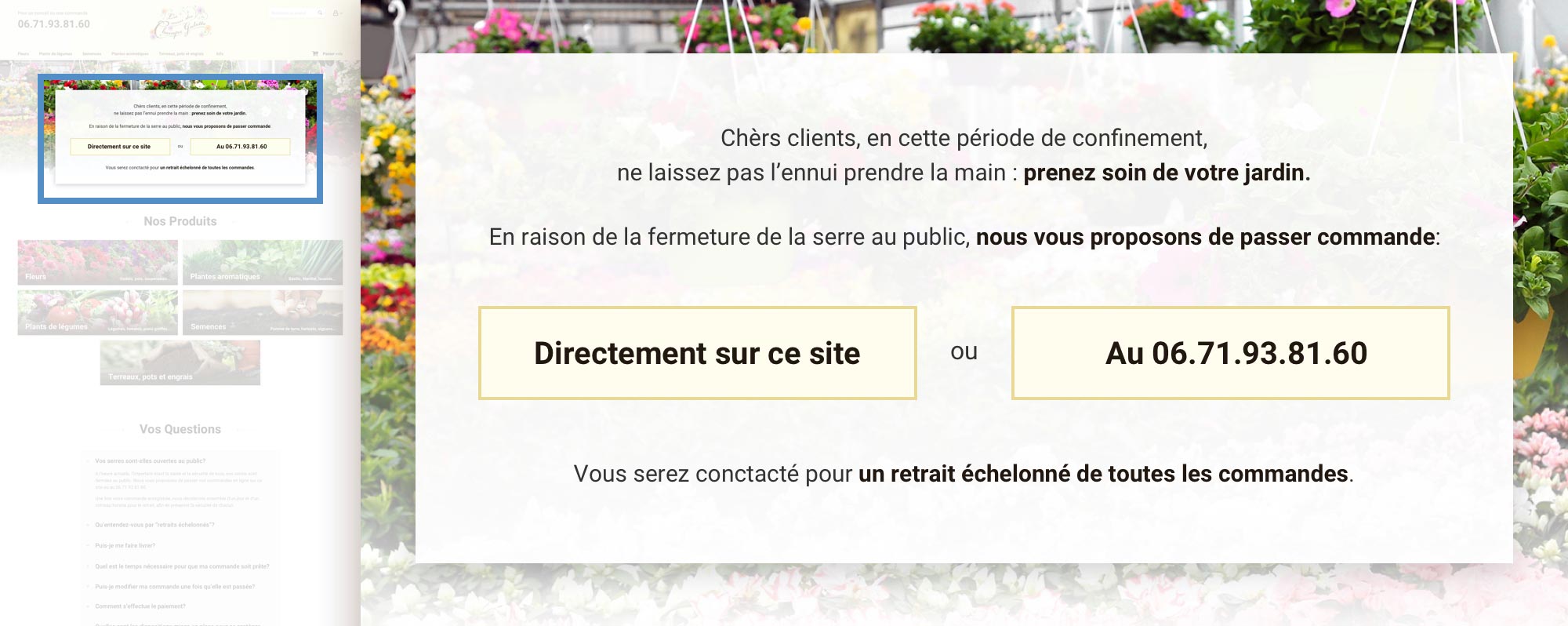
An information block on the home page gives two obvious actions, order on the site or call, and one sentence of context: orders are collected, pickups are staggered for everyone’s safety, and every customer is contacted to agree a day and a slot. Enough to make the situation clear, and not one detail more at that point of the visit.

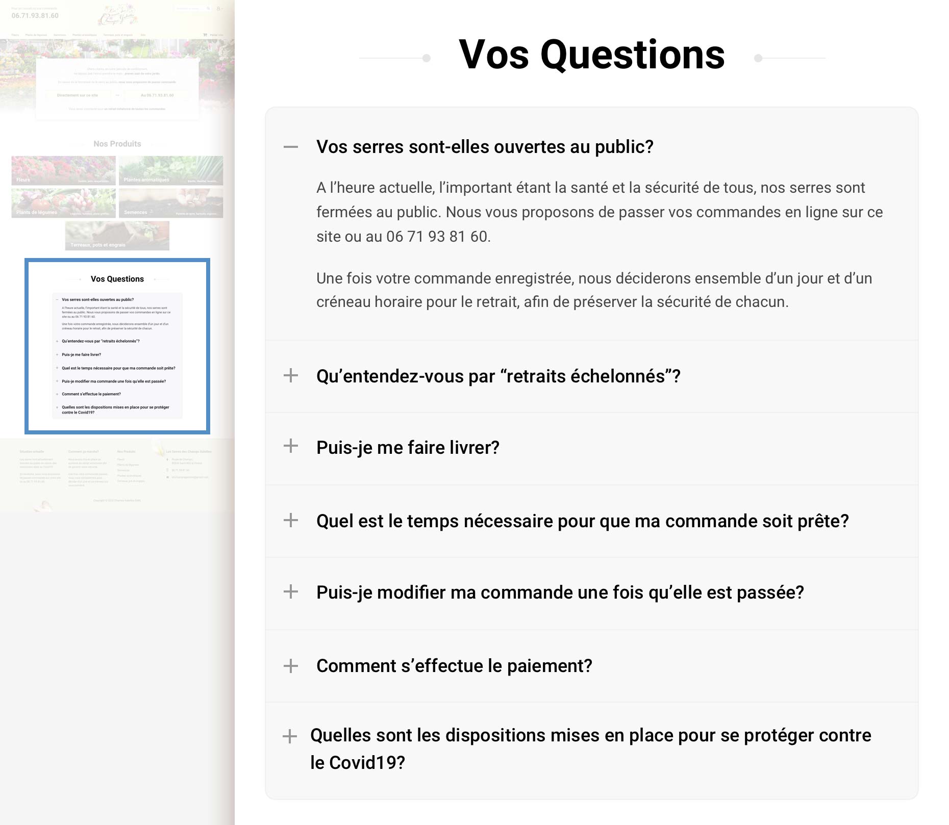
A “Your Questions” block further down the page answers, in detail, for those who want it now. Are the greenhouses open? What do you mean by staggered pickup? Can I be delivered? How long until my order is ready? Can I change it? How do I pay? What are you doing about COVID? These were the questions people were already asking on the phone.

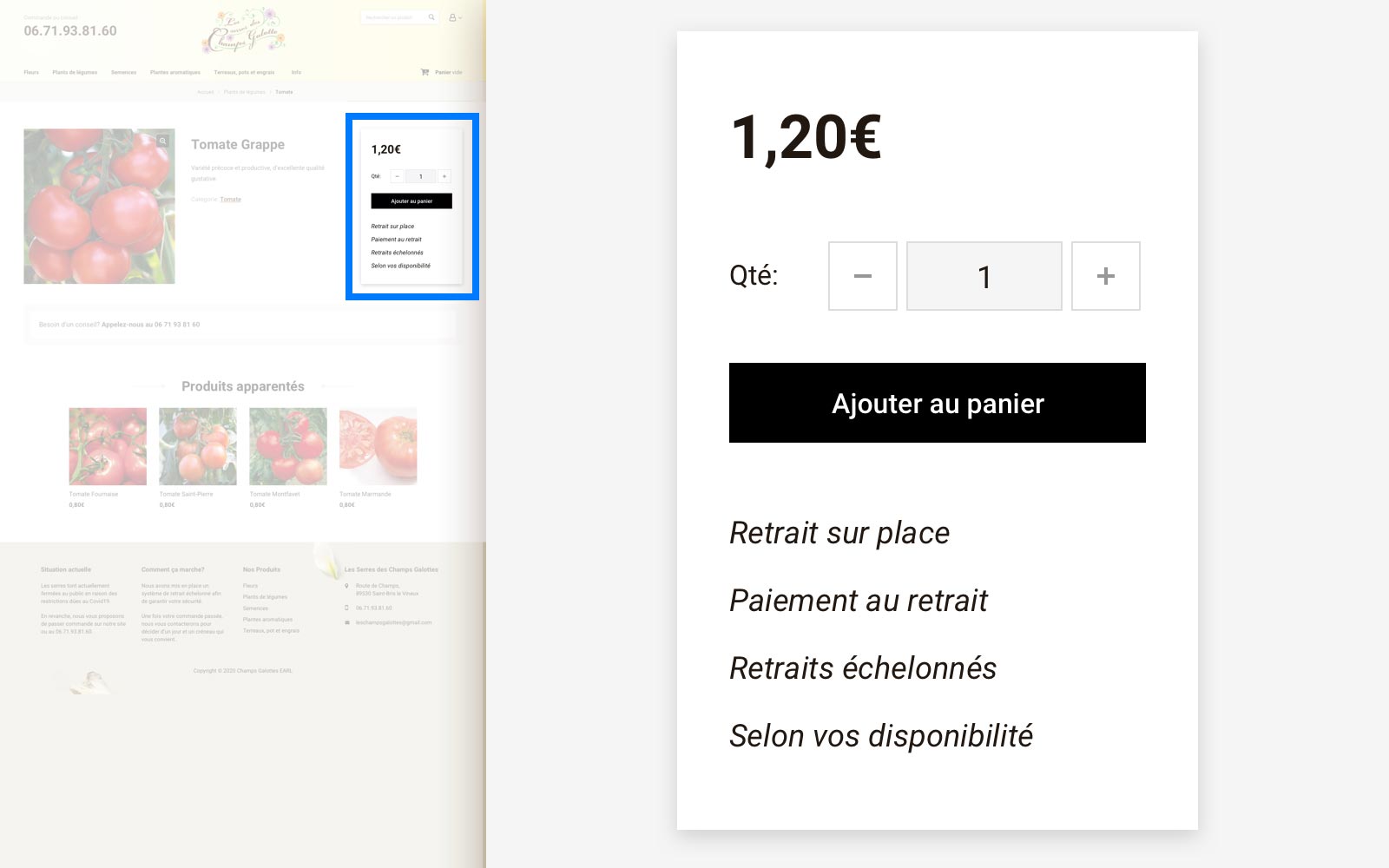
The four things to know sit right under the Add to cart button, at the exact moment someone hesitates. And under every product sheet, a line offering the phone number if advice is needed.

The footer repeats the situation on every page, because nobody scrolls back to the top to find it again.

The lockdown information block on the Champs Galottes home page
The home page block. “Dear customers, in this time of lockdown, do not let boredom take over: look after your garden. As the greenhouse is closed to the public, you can now order directly on this site, or on 06.71.93.81.60. We will contact you to arrange a staggered pickup.” Two buttons, same weight: the site, or the phone.
The header of the site with the phone number set large next to the logo
Header of every page. “To order or for advice”, then the number.
A band under the product offering advice by phone
And again under every product. “Need advice? Call us.”
A product page showing the four pickup rules directly under the Add to cart button
Under the Add to cart button: pickup on site, payment on pickup, staggered slots, at your convenience. Four lines, at the exact moment of hesitation.
The Your Questions accordion on the home page
“Your Questions”. The questions customers were already asking on the phone, answered on the page.
The footer explaining the current situation and how the pickup works
“Current situation” and “How it works”, repeated in the footer of every page.

Accessible, simple, linear

18px base font. Simple, and essential for this clientele.

A navigation you cannot get lost in. One Info page holds the practical information. Everything else points at products, so people browse the way they would walk through the greenhouse. A breadcrumb tells them where they are.

Every superfluous option removed. Every standard e-commerce block was hidden, leaving only what is strictly needed to place an order:

  • Wishlist
  • Product comparison
  • Social blocks
  • Coupons
  • Promotions
  • Newsletter
  • Ratings and reviews
  • Blog
  • Secure payment badges
  • Sidebar filters
  • SKUs

The secure payment badges went for a reason worth naming: there was no online payment left to secure. Removing the payment also removed a whole layer of reassurance the site no longer had to provide.

Each non essential option removed makes the ordering path simpler, smoother and more linear for someone who is not comfortable with the web.

The Champs Galottes navigation bar: six categories, a search field and a cart
The entire navigation, plus the breadcrumb. Flowers, vegetable plants, seeds, herbs, compost and pots, Info. No account area, no promotions, no filters, no sidebar.

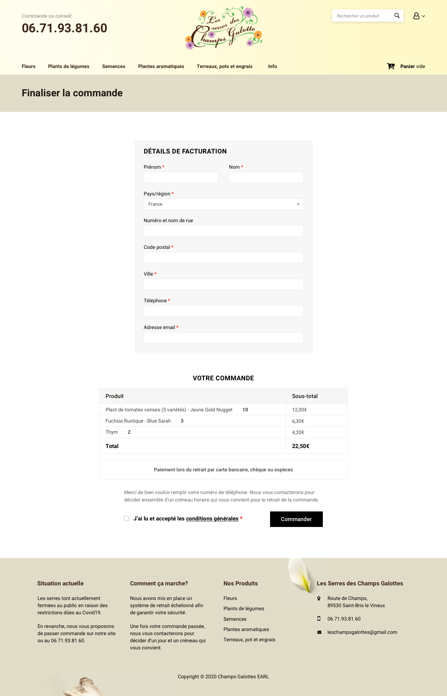
The checkout page, line by line

The checkout is the page that decides everything, and the page e-commerce templates make the most complicated. Stripping it is the clearest illustration of the whole approach, so here is what was actually done to it:

  • Promo code block removed.
  • “Ship to a different address” removed.
  • Subtotal lines removed. With no shipping, no VAT line and no promo code, the subtotal was always the total.
  • The mandatory terms checkbox moved right next to the final Order button, instead of sitting far above it.
  • The payment information block simplified to one sentence.
  • A plain sentence explaining why the phone number is required, since that is the number we call to arrange the pickup slot.
  • Every block recentred.
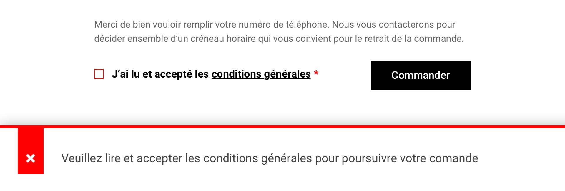
  • The error message made large and impossible to miss when something is missing.

What is left is a single page, no account creation, no shipping step, and no payment fields at all.

The full simplified checkout page of the Champs Galottes store
The page it sits on.
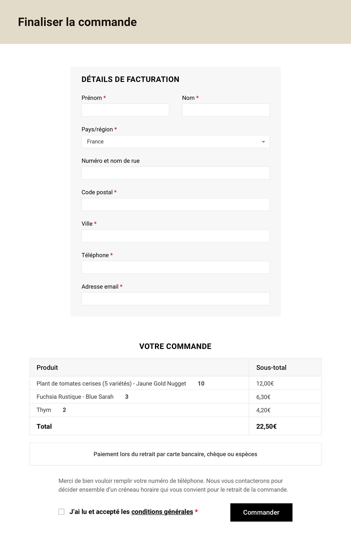
A close-up of the checkout form and the order summary
One page, no account, no shipping step, no payment field. Billing details, the order, the total, and “payment on pickup by card, cheque or cash”.
The checkout error message shown when the terms have not been accepted
The terms checkbox sits against the Order button, and the only error state in the store is written as a sentence rather than a code.

The thirty days that followed

The store went live with fifty products, and two hundred to come as the season produced them. We sent it to half a dozen friends first, to collect reactions, find the blockers and catch the typos. A few adjustments, and it was shared the same evening on the nursery’s Facebook page. March 30.

The next morning the phone started ringing. Fourteen orders on day one, with baskets averaging 30 to 40 euros, on a catalogue still limited to herbs and seeds.

Too early to relax. Those first orders came from younger customers who had seen the Facebook post. Would it stop there?

Two things became clear within days. After twelve days of lockdown under a beautiful sun, people badly wanted to garden, and the store felt like a release. And the drive system we had designed for our customers turned out to fit their needs exactly. Their reaction to it was unanimous.

Through April, the field experience refined everything. The greenhouse was reorganised, roles settled under Johann, picking got faster. I kept adjusting the site, the categories, the products. The orders never stopped growing. And the customers became the promoters: group orders, word of mouth, neighbours calling neighbours.

What real usage taught me

Ordering online is gardening. April was sunny throughout. When the grey and the showers came back at the end of the month, the pattern showed up: the number of online orders tracked the weather, hour by hour. One Saturday says it all. Two quiet days, a morning of rain, then three hours of sun in the afternoon. Orders poured in for those three hours, and stopped with the sun. In the customer’s mind, ordering plants online had become part of gardening time.

The store as a pastime. Some customers browsed the site for tens of minutes, several times a day. Every time an awaited product went on sale, orders were added within minutes, well before any Facebook announcement.

A new, younger clientele. Lockdown and online ordering brought in families who were growing vegetables for the first time. Many of them used the pickup to ask for advice.

Stockouts nobody had ever seen. The combination of lockdown and online sales produced buying behaviour that was impossible to anticipate. Beetroot, normally available until mid May, was out of stock two days after launch. Lemon thyme and other herbs went the same way. Compost, basil and marigolds never lasted more than two days after a delivery.

What I keep from it

Orders tapered off as the end of lockdown approached, and customers started asking when they could walk through the greenhouse again. The greenhouse had emptied enough to be reorganised safely, and it opened to the public on May 11, the first day of reopening. Afternoons at first, then all day. A week later I removed online ordering and rewrote the site to announce that the greenhouse was open. The end of the season ran like any other.

April revenue ended 170% above the biggest April ever recorded. Labour and restocking costs rose sharply too, but the season was more than good.

Customer first, literally. Every decision was taken with one question in front of it: is this the best possible option for our customers? With hindsight, every one of those calls held, and every point that could have blocked us turned in our favour.

A loyal clientele was the second pillar. Ten years of reputation, and a grower who advises his customers day after day. The orders could never have taken off the way they did if those customers had not played the game and passed the shop on to the people around them.

The UX / design balance. On every project before this one I treated my job as double: the best possible experience, and a high level of visual quality. This one was the exception. Given the situation, I dropped the aesthetics completely and worked on the UX alone.

And the irony is that I have never received so many compliments in person on anything I have designed. Dozens a day, at pickup, from people in their seventies calling the site “simple”, “formidable”. Those remain the ultimate compliments, because they are the people I designed it for first.

Flowering geraniums